
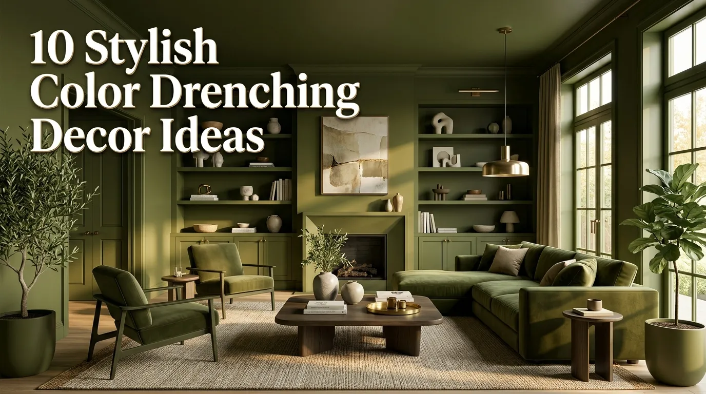
10 Stylish Color Drenching Decor Ideas
Color has the power to completely transform how a room feels, but many homeowners hesitate to embrace bold paint because they’re worried it will make a space feel smaller or overwhelming. That’s exactly why color drenching has become one of the biggest interior design trends on Pinterest and in modern homes. Instead of using a single accent wall, this technique wraps an entire room in one carefully selected color, creating a cohesive, sophisticated, and surprisingly calming environment.
In my experience, the secret to successful color drenching isn’t choosing the brightest shade possible—it’s selecting a color that complements your home’s architecture, natural light, and furnishings. When the walls, trim, ceiling, and sometimes even built-in furniture share a similar tone, the room feels intentionally designed rather than visually busy. The result is a luxurious look that works equally well in modern, traditional, Scandinavian, and contemporary interiors.
Whether you’re decorating a cozy bedroom, a welcoming living room, a stylish home office, or even a dramatic dining room, these ideas will help you confidently explore this trend. You’ll discover how different color families create completely different moods, along with practical styling tips that make each palette feel balanced, elegant, and Pinterest-worthy.
Table of Contents
- Warm Beige Wrap
Create a soft, timeless backdrop that feels warm and inviting. - Moody Olive Charm
Bring depth and natural character into your home. - Dusty Blue Retreat
Design a peaceful space inspired by calming skies. - Rich Terracotta Glow
Introduce earthy warmth with a welcoming palette. - Charcoal Sophistication
Create bold elegance with dramatic neutral tones. - Soft Sage Serenity
- Cream Monochrome
- Deep Navy Luxury
- Muted Clay Comfort
- Chocolate Brown Depth
1. Warm Beige Wrap
Quick Benefits
- Makes rooms feel warm and welcoming.
- Creates a timeless designer look.
- Works with every decorating style.
- Complements natural materials beautifully.
- Provides an excellent neutral foundation.
Why It Works
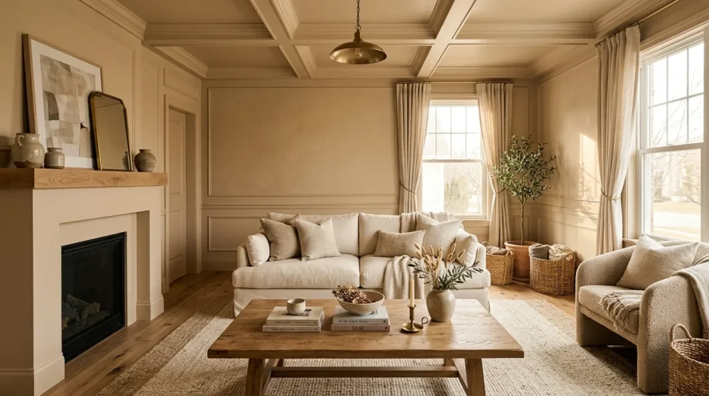
Warm beige is one of the easiest colors to use for color drenching because it feels cozy without becoming visually heavy. Instead of creating sharp contrast between walls and trim, painting architectural details in the same family allows the eye to move smoothly throughout the room. I’ve noticed this approach makes spaces feel larger while also creating a relaxing atmosphere. Warm beige pairs beautifully with wood, linen, stone, and woven textures, making it an ideal choice for homeowners who want a sophisticated look that won’t quickly go out of style.
How To Style It
Paint the walls, trim, doors, and ceiling in coordinated warm beige shades with a matte or eggshell finish. Layer linen curtains, boucle seating, oak furniture, and woven baskets to introduce texture while keeping the palette cohesive. Add ceramic vases, natural stone accessories, and soft lighting to create depth without relying on contrasting colors. Finish with greenery to provide subtle freshness against the neutral backdrop.
2. Moody Olive Charm
Quick Benefits
- Creates rich visual depth.
- Adds a luxurious natural feel.
- Enhances wood furniture.
- Feels cozy throughout the year.
- Works beautifully in living rooms and bedrooms.
Why It Works
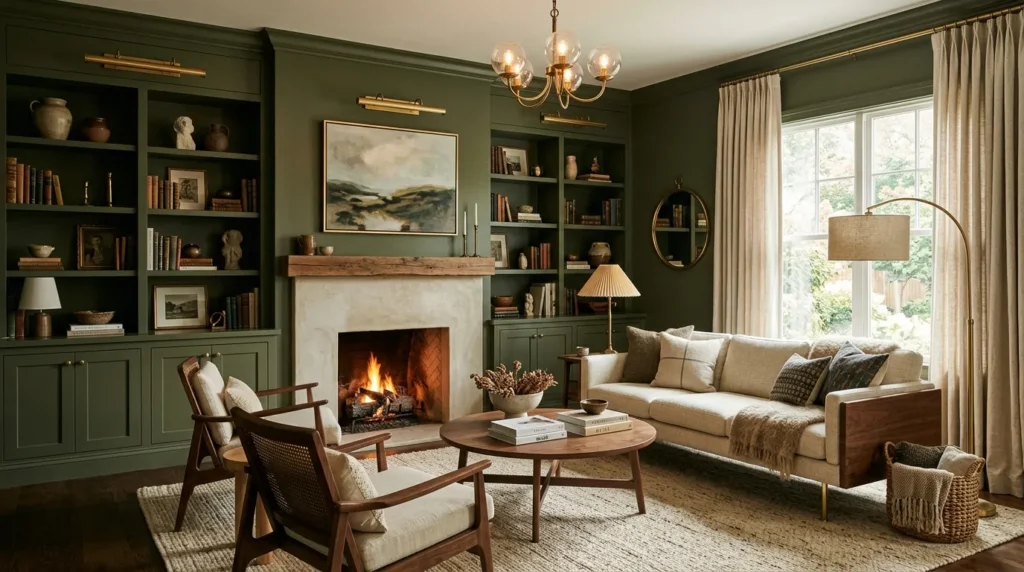
Moody olive brings together earthy elegance and dramatic sophistication. By extending this color across walls, trim, shelving, and even cabinetry, the room feels enveloped in warmth rather than divided into separate surfaces. That’s why many designers recommend olive green for spaces meant to encourage relaxation and conversation. The muted undertone keeps the color refined while allowing artwork, lighting, and textured fabrics to stand out naturally.
How To Style It
Use olive paint throughout the room and pair it with walnut or oak furniture, linen upholstery, antique brass lighting, and cream textiles. Incorporate woven rugs, leather accents, and handcrafted pottery to reinforce the organic aesthetic. Soft warm-white lighting helps highlight the richness of the color during both daytime and evening hours.
3. Dusty Blue Retreat
Quick Benefits
- Creates a calming atmosphere.
- Reflects natural light beautifully.
- Feels timeless and elegant.
- Pairs well with white and wood.
- Perfect for restful spaces.
Why It Works
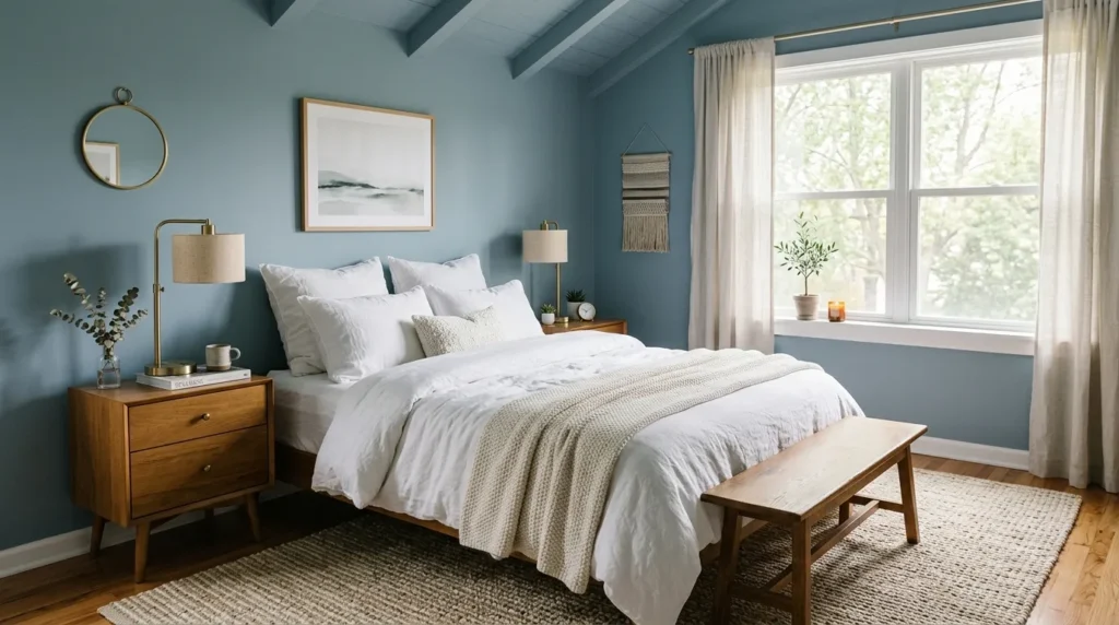
Dusty blue offers the serenity of traditional blue interiors without feeling overly bright or cold. Wrapping an entire room in this muted shade softens architectural lines and creates a cocoon-like effect that encourages relaxation. One thing that works especially well is combining dusty blue with natural textures, which prevents the room from feeling overly formal while maintaining an elegant, cohesive appearance.
How To Style It
Paint walls, trim, and ceiling in coordinated dusty blue tones. Introduce light oak furniture, crisp white bedding, linen curtains, woven baskets, and brushed brass lighting. Add subtle artwork with neutral accents rather than bold colors so the peaceful atmosphere remains the focal point.
4. Rich Terracotta Glow
Quick Benefits
- Adds warmth and personality.
- Creates a welcoming environment.
- Complements handcrafted décor.
- Works well with earthy materials.
- Brings natural character indoors.
Why It Works
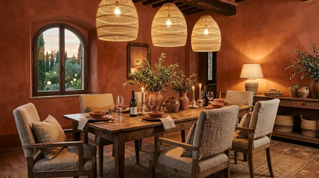
Terracotta creates an inviting atmosphere inspired by sunbaked clay and Mediterranean interiors. Using this color across multiple surfaces gives the room a seamless appearance while emphasizing warmth over contrast. The earthy undertones pair naturally with wood, stone, linen, and greenery, resulting in a space that feels relaxed yet refined.
How To Style It
Choose muted terracotta paint for walls, trim, and built-ins. Layer cream upholstery, woven lighting, jute rugs, and natural wood furniture throughout the room. Finish with ceramic pottery, olive branches, and textured cushions to enhance the collected, organic look.
5. Charcoal Sophistication
Quick Benefits
- Creates dramatic elegance.
- Highlights architectural details.
- Makes artwork stand out.
- Adds depth to large rooms.
- Feels modern and luxurious.
Why It Works
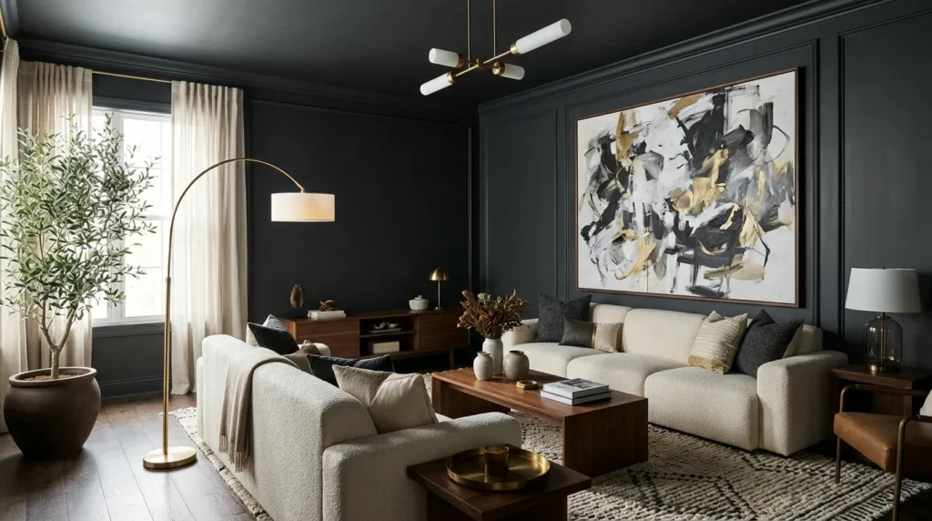
Charcoal proves that dark colors can feel sophisticated rather than overwhelming. When applied consistently across walls, trim, and ceilings, charcoal creates a cocooning effect that makes furnishings and lighting become the stars of the room. In my experience, this approach works especially well in rooms with generous natural light, where the darker palette feels balanced instead of heavy.
How To Style It
Use charcoal paint with matte finishes for a soft, contemporary appearance. Balance the depth with cream upholstery, warm wood furniture, textured rugs, brass accents, and layered lighting. Incorporate mirrors and reflective décor sparingly to bounce light around the room while preserving the dramatic atmosphere.
6. Soft Sage Serenity
Quick Benefits
- Creates a calm and refreshing atmosphere.
- Brings nature-inspired color indoors.
- Complements neutral furnishings.
- Works beautifully in bedrooms and offices.
- Feels timeless rather than trendy.
Why It Works
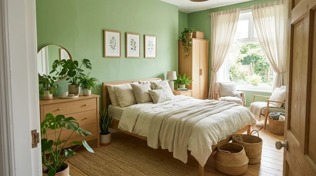
Soft sage has become a favorite among interior designers because it introduces color without overwhelming a space. When walls, trim, built-ins, and even shelving are painted in coordinating sage tones, the room feels peaceful and unified. I’ve seen this palette completely transform ordinary rooms into relaxing retreats because the muted green reflects natural light beautifully while creating an organic connection with plants, wood, and woven materials.
How To Style It
Paint the entire room in a soft sage shade and pair it with light oak furniture, cream upholstery, linen curtains, and woven baskets. Incorporate ceramic vases, natural stone accessories, and indoor plants to reinforce the botanical feel. Use warm lighting to enhance the cozy atmosphere while maintaining the room’s airy appearance.
7. Cream Monochrome
Quick Benefits
- Makes rooms appear larger.
- Creates a luxurious hotel-inspired feel.
- Enhances natural light.
- Works with every decorating style.
- Provides endless styling flexibility.
Why It Works
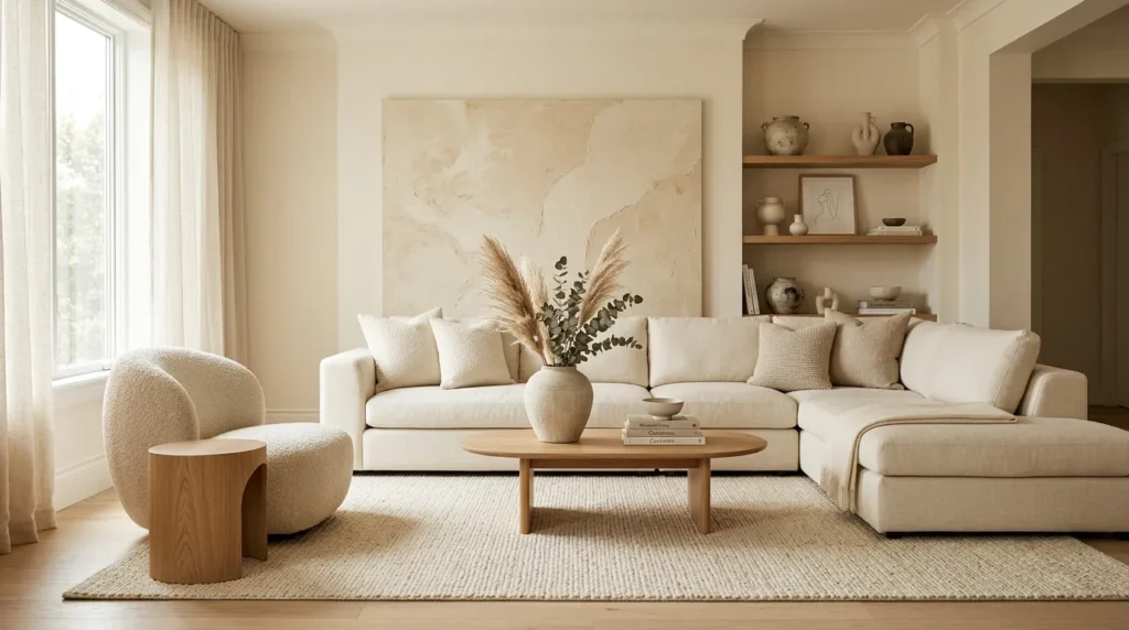
Cream monochrome proves that subtle color changes can have a dramatic impact. Rather than relying on bright white, layering creamy shades throughout the room creates warmth while maintaining a clean, elegant aesthetic. That’s why many designers recommend this palette for smaller rooms where maximizing light is important. Texture becomes the star, allowing fabrics, furniture, and architectural details to shine.
How To Style It
Use creamy paint on the walls, ceiling, trim, and built-in cabinetry. Layer boucle chairs, linen sofas, textured rugs, knitted throws, and upholstered furniture in similar tones. Introduce natural wood and soft brass finishes for understated contrast while keeping accessories minimal to preserve the sophisticated appearance.
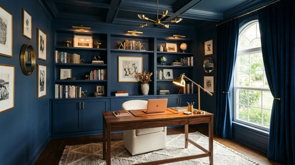
8. Deep Navy Luxury
Quick Benefits
- Creates a bold designer look.
- Adds timeless sophistication.
- Highlights artwork beautifully.
- Feels cozy during every season.
- Pairs well with metallic finishes.
Why It Works
Deep navy is one of the most elegant choices for color drenching because it creates depth without feeling as stark as black. Wrapping a room in rich navy makes architectural details disappear visually, allowing furniture and decorative accessories to stand out naturally. One simple trick I always suggest is pairing navy with warm lighting to keep the room feeling inviting instead of overly formal.
How To Style It
Paint walls, trim, ceiling, and shelving in matching navy tones. Add cream upholstery, walnut furniture, brass lighting, velvet cushions, and textured curtains to soften the darker palette. Incorporate large mirrors if the room receives limited daylight to help reflect light throughout the space.
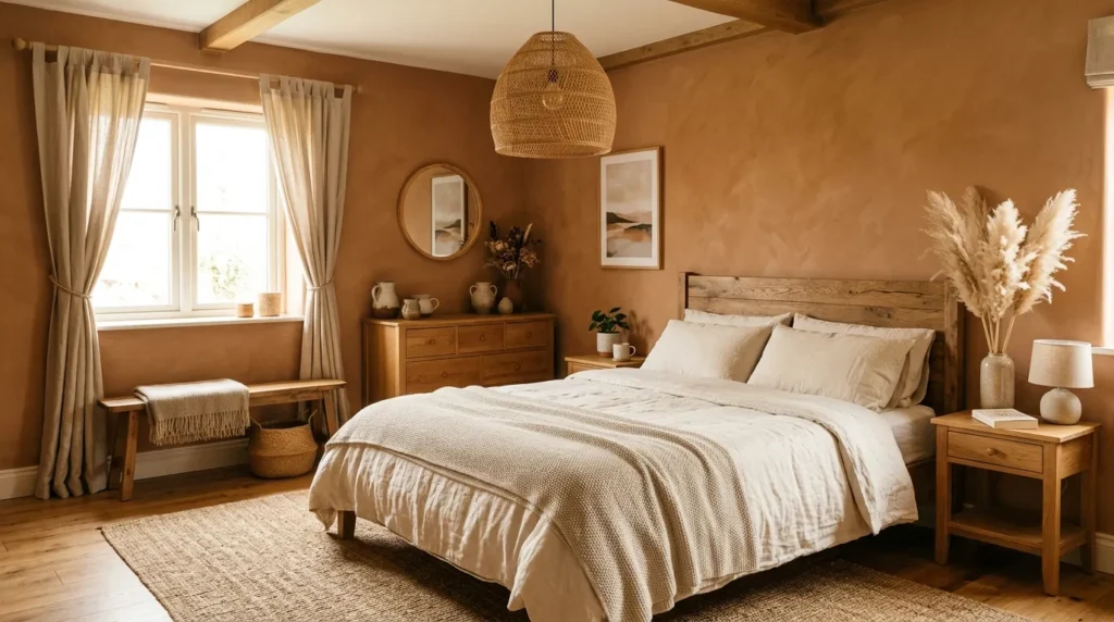
9. Muted Clay Comfort
Quick Benefits
- Adds earthy warmth.
- Creates a cozy atmosphere.
- Complements handcrafted décor.
- Feels welcoming year-round.
- Works beautifully with natural textures.
Why It Works
Muted clay captures the warmth of traditional terracotta while offering a softer, more versatile appearance. This earthy tone surrounds the room with comfort and personality, making it ideal for living rooms, dining spaces, and bedrooms. The subtle reddish undertones pair naturally with linen, wood, stone, and woven materials, resulting in a balanced interior that feels collected rather than overly decorated.
How To Style It
Cover walls, trim, and built-ins with muted clay paint, then layer cream seating, woven rugs, wooden furniture, and ceramic accessories throughout the room. Add olive greenery and textured throws to introduce contrast while maintaining the organic feel. Warm white lighting enhances the richness of the color during evening hours.
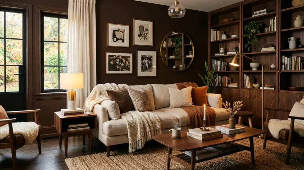
10. Chocolate Brown Depth
Quick Benefits
- Creates rich visual drama.
- Feels luxurious and comforting.
- Highlights lighter furnishings.
- Adds timeless elegance.
- Works especially well in larger rooms.
Why It Works
Chocolate brown has made a strong comeback because it creates warmth while feeling sophisticated and grounded. Color drenching with this rich shade wraps the room in comfort and gives neutral furniture an elevated appearance. In my experience, chocolate brown looks especially beautiful when combined with creamy upholstery, walnut furniture, and layered lighting, creating interiors that feel inviting instead of dark.
How To Style It
Paint the walls, trim, and ceiling in a warm chocolate brown with a matte finish. Pair the rich backdrop with cream linen sofas, oak or walnut furniture, woven baskets, brass accents, and oversized artwork. Finish with textured rugs and soft lighting to create depth while maintaining a cozy atmosphere.
Frequently Asked Questions
What is color drenching in interior design?
Color drenching is a decorating technique where walls, trim, ceilings, doors, and sometimes built-in furniture are painted in the same or closely related color. This creates a seamless, cohesive appearance that makes a room feel intentionally designed and visually balanced.
Does color drenching make a room look smaller?
Not necessarily. When done correctly, using one continuous color can blur architectural lines, making a room feel larger and more cohesive. Lighter shades reflect more light, while darker shades create a cozy, enveloping atmosphere.
Which rooms work best for color drenching?
Living rooms, bedrooms, dining rooms, home offices, powder rooms, and reading nooks are all excellent candidates. The technique works in both large and small spaces when paired with appropriate lighting and furnishings.
What finish should I choose?
Many designers prefer matte or eggshell finishes for walls because they soften light and create a luxurious appearance. Satin or semi-gloss can be used on trim if you want subtle contrast while staying within the same color family.
How do I decorate a color-drenched room?
Focus on texture rather than strong color contrast. Linen fabrics, woven baskets, natural wood, ceramic décor, stone accessories, and layered lighting all add visual interest while maintaining harmony.
Can renters try this trend?
Yes. If painting isn’t possible, use removable wallpaper, large textiles, matching curtains, rugs, and coordinated accessories in the same color family to create a similar effect without making permanent changes.
Conclusion
Color drenching is more than a passing trend—it’s a timeless decorating approach that creates rooms filled with depth, warmth, and personality. Whether you prefer soft neutrals, calming greens, earthy terracotta, dramatic charcoal, or rich navy, wrapping an entire room in one carefully chosen color instantly creates a polished, designer-inspired look.
The beauty of this technique is its flexibility. You can create a bright, airy retreat or a dramatic, cozy sanctuary simply by adjusting the shade and layering complementary textures. Start with the palette that best reflects your style, incorporate natural materials, and build your décor gradually. With thoughtful styling, you’ll create a home that’s elegant, comfortable, and worthy of saving to every Pinterest inspiration board.
Related Articles
- 10 Earth Tone Living Room Ideas
- 10 Cozy Neutral Bedroom Ideas
- 10 Modern Organic Home Decor Ideas
- 10 Warm Minimalist Living Room Ideas
- 10 Beautiful Monochromatic Room Ideas