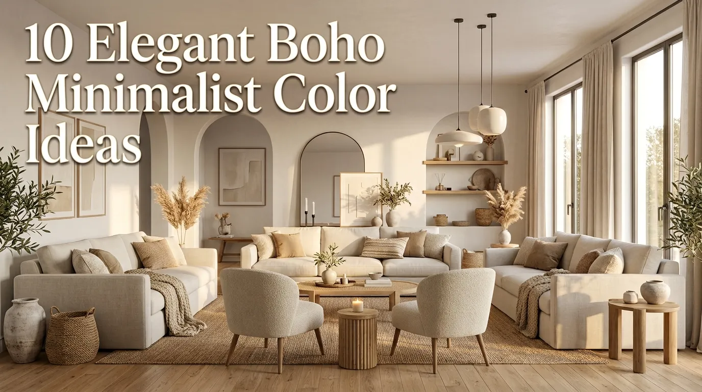
10 Elegant Boho Minimalist Color Ideas
Decorating with color can completely transform the mood of a room, but finding the perfect balance between warm bohemian charm and clean minimalist design isn’t always easy. Many people love the relaxed, layered look of boho interiors yet also appreciate the calm simplicity that makes minimalist spaces feel bright and organized. The secret lies in choosing the right color palette rather than filling a room with endless decorative pieces.
I’ve noticed that the most beautiful boho minimalist homes don’t rely on loud colors or excessive accessories. Instead, they use soft earthy shades, natural materials, subtle contrast, and layered textures to create warmth without visual clutter. The result is a home that feels peaceful, welcoming, and effortlessly stylish while still reflecting your personality.
Whether you’re decorating a bedroom, living room, apartment, or small home, choosing a thoughtful color palette makes every decorating decision easier. Furniture, textiles, artwork, lighting, and accessories naturally work together when the colors feel cohesive. That’s one reason these interiors continue to dominate Pinterest—they’re timeless, versatile, and easy to personalize.
In this guide, you’ll discover ten elegant color ideas inspired by nature, organic textures, and modern design. Each palette offers practical decorating inspiration along with styling tips that help you create a cozy, balanced home you’ll love coming back to every day.
Table of Contents
- Warm Sand Palette
Create a soft neutral foundation inspired by natural landscapes. - Sage Green Calm
Bring peaceful botanical tones into your home. - Cream Layering
Build depth with timeless neutral shades. - Terracotta Warmth
Introduce earthy character through warm clay-inspired colors. - Soft Taupe Blend
Combine sophisticated neutrals for effortless elegance. - Muted Olive Style
- Clay And Beige
- Warm White Base
- Natural Wood Harmony
- Black Accent Balance
1. Warm Sand Palette
Quick Benefits
- Creates a calming atmosphere.
- Works in every room.
- Makes spaces feel brighter.
- Pairs beautifully with natural materials.
- Never goes out of style.
Why It Works
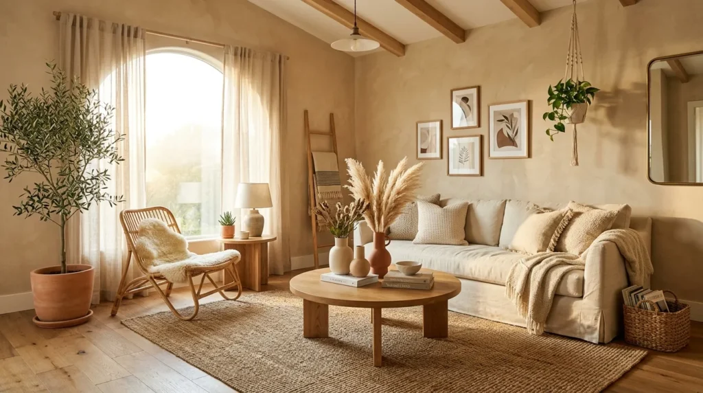
A warm sand color palette is one of the easiest ways to combine minimalist simplicity with bohemian warmth. Unlike cool white interiors that can sometimes feel stark, sandy neutrals create an inviting backdrop while keeping the room open and airy. In my experience, this palette also highlights natural textures beautifully, allowing wood furniture, woven baskets, linen fabrics, and handmade ceramics to become part of the design rather than competing for attention. Because these earthy tones are inspired by nature, they create a relaxing environment that feels timeless instead of trend-driven.
How To Style It
Paint walls in a warm sand or light beige shade and layer the room with cream linen curtains, ivory bedding, woven jute rugs, and light oak furniture. Add textured cushions in oatmeal and soft camel tones to introduce subtle variation without disrupting the calm aesthetic. Complete the look with ceramic vases, pampas grass, woven pendant lighting, and handcrafted décor that enhances the natural warmth of the palette.
2. Sage Green Calm
Quick Benefits
- Brings nature indoors.
- Creates a peaceful environment.
- Complements neutral furniture.
- Works beautifully with wood finishes.
- Adds color without overwhelming the room.
Why It Works
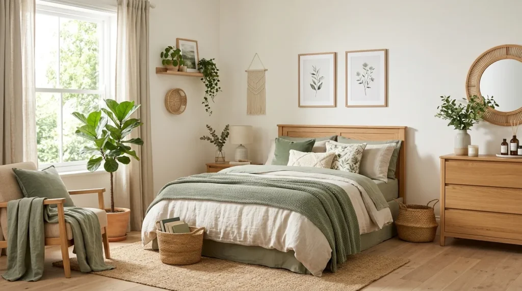
Sage green has become one of the most loved colors in modern interiors because it feels refreshing while remaining soft enough for minimalist spaces. That’s why many designers recommend it as an accent color instead of relying on brighter greens. It introduces a subtle botanical influence that instantly makes a room feel more relaxing. I’ve seen this shade transform bedrooms and living rooms by adding just enough color to create interest while preserving the clean, uncluttered feeling that defines minimalist decorating.
How To Style It
Pair sage green walls or accessories with warm white furniture, light oak finishes, linen upholstery, and woven textures. Introduce the color through throw pillows, artwork, bedding, or a painted accent wall if you prefer a smaller commitment. Finish the space with indoor plants, ceramic pottery, and natural fiber baskets to reinforce the organic look while maintaining visual harmony.
3. Cream Layering
Quick Benefits
- Makes rooms feel luxurious.
- Brightens small spaces.
- Creates timeless elegance.
- Enhances natural lighting.
- Provides endless decorating flexibility.
Why It Works
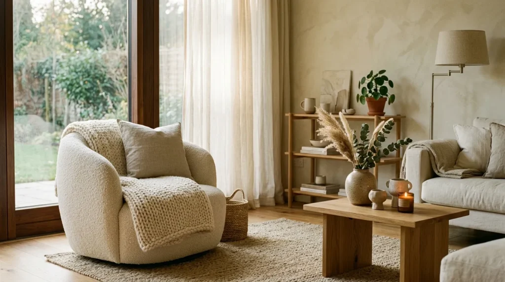
Cream is one of the most versatile colors for creating a cozy boho minimalist interior because it offers more warmth than bright white while maintaining a fresh appearance. Layering multiple shades of cream, ivory, and soft beige prevents a neutral room from looking flat. One thing that works especially well is combining different textures within the same color family. Linen, boucle, cotton, wool, and natural wood all contribute depth without requiring bold colors, allowing every element to feel soft, sophisticated, and welcoming.
How To Style It
Use cream as the dominant color for walls, bedding, sofas, or large furniture pieces. Layer textured throws, woven baskets, boucle accent chairs, and linen cushions to build visual interest. Add warm brass lighting, wooden picture frames, and handcrafted pottery to introduce subtle contrast while preserving the calm atmosphere. Keep decorative accessories minimal so each carefully selected texture has room to stand out.
4. Terracotta Warmth
Quick Benefits
- Adds earthy richness.
- Creates cozy seasonal style.
- Balances neutral interiors.
- Works year-round.
- Complements handcrafted décor.
Why It Works
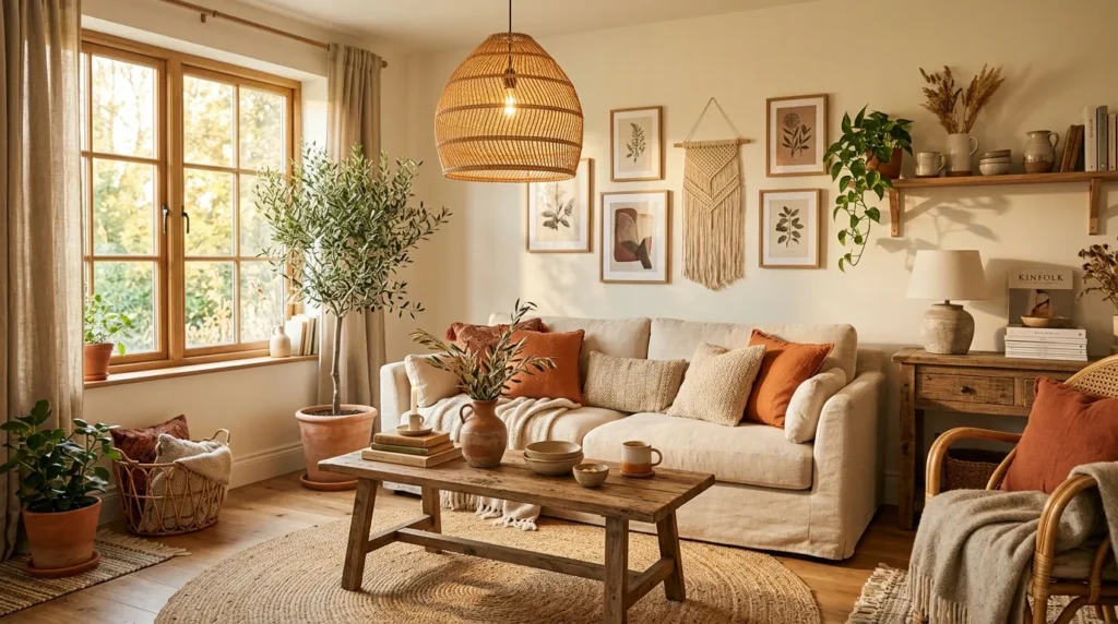
Terracotta introduces warmth inspired by sunbaked clay, desert landscapes, and handcrafted pottery. Unlike bright orange tones, muted terracotta feels grounded and sophisticated, making it an excellent choice for boho minimalist interiors. Its earthy character pairs naturally with woven materials, linen fabrics, wood furniture, and organic greenery, creating a welcoming space that feels relaxed without becoming visually overwhelming.
How To Style It
Introduce terracotta through cushions, throws, artwork, pottery, or an accent chair instead of painting every wall. Pair it with cream walls, oak furniture, woven rugs, and black metal accents for subtle contrast. Complete the room with dried pampas grass, olive branches, and handmade ceramic décor to reinforce the natural, collected aesthetic.
5. Soft Taupe Blend
Quick Benefits
- Creates understated elegance.
- Adds warmth without darkness.
- Blends effortlessly with neutrals.
- Suitable for every decorating style.
- Makes interiors feel sophisticated.
Why It Works
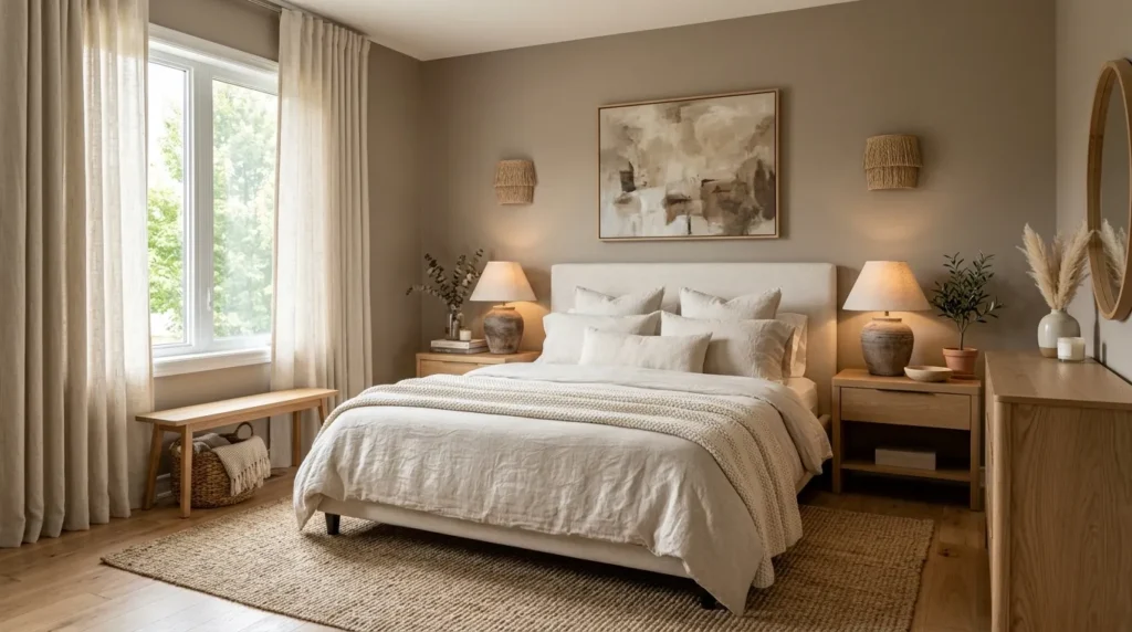
Soft taupe sits perfectly between gray and beige, offering warmth with a refined appearance. This versatile shade works exceptionally well as a bridge between minimalist architecture and bohemian textures. Because taupe is naturally muted, it allows statement furniture, layered textiles, and artisan accessories to stand out without making the room feel busy. The overall effect is calming, balanced, and effortlessly elegant.
How To Style It
Use taupe on walls, upholstered furniture, or large area rugs to establish a sophisticated base. Layer cream bedding, linen curtains, woven baskets, light wood furniture, and matte ceramic accessories throughout the space. Add subtle black accents through lighting or picture frames for gentle contrast while keeping the overall palette soft and cohesive.
6. Muted Olive Style
Quick Benefits
- Adds rich natural color.
- Creates a grounded atmosphere.
- Pairs beautifully with wood and linen.
- Works in every season.
- Brings timeless character.
Why It Works
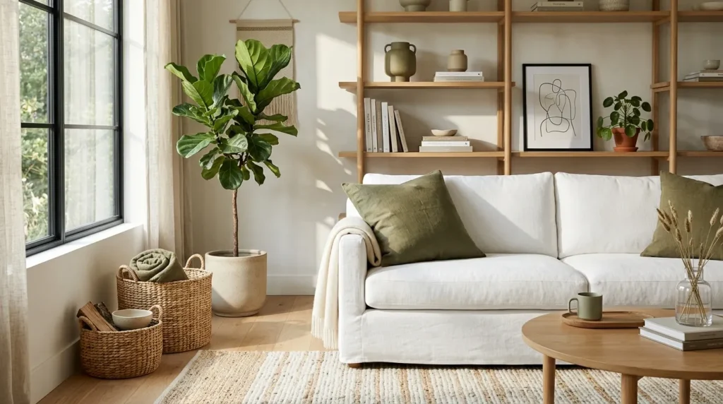
Muted olive green captures the beauty of nature without overwhelming a minimalist space. It’s deeper than sage yet softer than forest green, making it perfect for creating warmth while maintaining a clean aesthetic. I’ve noticed this shade works especially well in homes that receive plenty of natural light because it adds depth without making the room feel heavy. Combined with organic textures and neutral furnishings, muted olive creates a relaxed environment that’s both sophisticated and inviting.
How To Style It
Introduce muted olive through accent walls, decorative pillows, curtains, artwork, or upholstered furniture. Pair it with warm white walls, oak furniture, woven baskets, linen textiles, and matte ceramic accessories. Complete the look with indoor plants, textured rugs, and soft lighting to create a welcoming space that feels connected to nature while remaining effortlessly elegant.
7. Clay And Beige
Quick Benefits
- Creates a warm desert-inspired palette.
- Adds cozy character.
- Works beautifully with handcrafted décor.
- Feels timeless and relaxing.
- Easy to personalize.
Why It Works
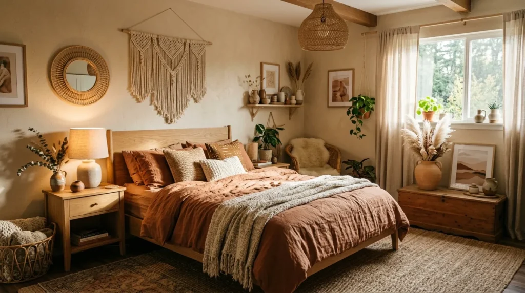
Clay and beige create a beautiful combination inspired by natural landscapes and handcrafted materials. These warm tones work together to make interiors feel comfortable without appearing overly colorful. One thing that works especially well is using beige as the primary backdrop while allowing clay-inspired accents to introduce depth. This subtle contrast creates a layered look that’s rich in texture rather than visual noise, making it ideal for boho minimalist decorating.
How To Style It
Keep walls in soft beige and incorporate clay-colored cushions, ceramic vases, artwork, or throw blankets throughout the room. Add woven pendant lights, natural wood furniture, jute rugs, and linen curtains to reinforce the organic aesthetic. Finish with dried grasses and handcrafted pottery for a collected, designer-inspired appearance.
8. Warm White Base
Quick Benefits
- Brightens every room.
- Makes small spaces feel larger.
- Creates a timeless foundation.
- Enhances natural light.
- Complements every decorating style.
Why It Works
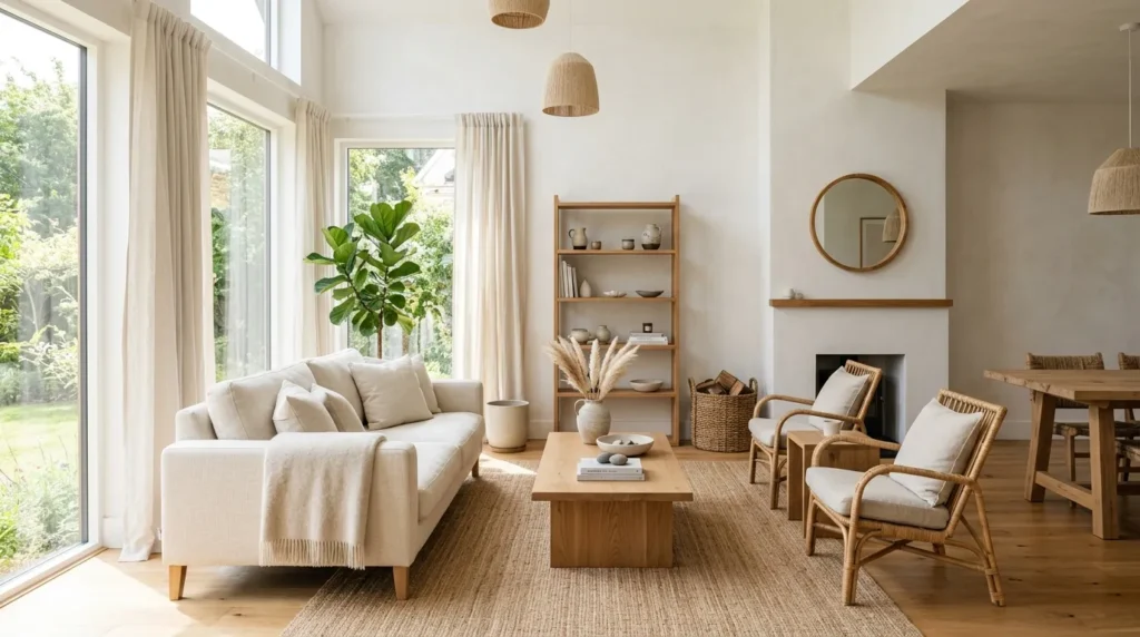
Warm white provides the perfect backdrop for minimalist interiors because it reflects light while feeling softer than crisp bright white. Unlike cooler shades, warm white creates an inviting atmosphere that works beautifully with earthy materials and layered textures. That’s why many designers recommend warm white when decorating homes that combine simplicity with natural warmth. It allows decorative details to stand out while maintaining an open and airy feeling.
How To Style It
Paint walls in a warm white finish and combine them with oak furniture, linen upholstery, woven rugs, and textured bedding. Add subtle accents in beige, camel, olive, or terracotta to prevent the room from feeling flat. Include warm lighting and handcrafted accessories to create a cozy atmosphere that remains clean and uncluttered.
9. Natural Wood Harmony
Quick Benefits
- Brings warmth into neutral spaces.
- Adds beautiful texture.
- Complements every color palette.
- Creates timeless appeal.
- Softens minimalist interiors.
Why It Works
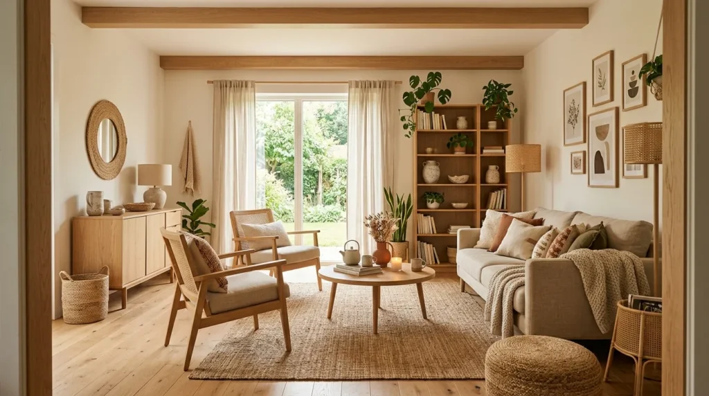
Natural wood isn’t just a material—it’s an essential part of many successful boho minimalist interiors. Whether light oak, walnut, or ash, wood introduces warmth and authenticity that painted furniture often cannot replicate. In my experience, repeating similar wood tones throughout a room creates consistency while allowing neutral colors to feel more dynamic. The grain, texture, and natural imperfections add personality without competing with the overall simplicity of the design.
How To Style It
Choose wooden bed frames, coffee tables, shelving, or dining furniture with clean lines. Pair them with linen fabrics, woven baskets, ceramic décor, and soft neutral textiles. Avoid mixing too many different wood tones within the same room. Instead, repeat one or two complementary finishes to create a cohesive and polished appearance.
10. Black Accent Balance
Quick Benefits
- Creates elegant contrast.
- Defines architectural details.
- Adds modern sophistication.
- Highlights lighter colors.
- Elevates minimalist styling.
Why It Works
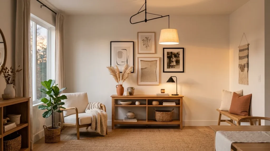
Black may seem unexpected in a soft boho palette, but used sparingly, it provides beautiful contrast that helps neutral colors stand out. Thin black picture frames, lighting fixtures, curtain rods, and decorative accessories create visual structure without overpowering the room. Rather than making the space feel darker, these accents add definition and balance that enhance the overall design.
How To Style It
Limit black accents to small decorative elements like lamps, cabinet hardware, mirrors, artwork frames, or side tables. Pair them with warm whites, beige, natural wood, and woven textures to soften the contrast. Maintaining a light overall palette ensures the black details feel intentional and refined rather than dramatic.
Frequently Asked Questions
What colors define a boho minimalist style?
Warm whites, cream, beige, taupe, sage green, muted olive, terracotta, clay, and natural wood tones form the foundation of a beautiful boho minimalist palette. These colors create warmth while maintaining a clean and uncluttered appearance.
Can I use bold colors in a boho minimalist home?
Yes, but use them sparingly. Choose one or two accent colors and repeat them throughout the room rather than introducing many bright shades. This keeps the design cohesive while still allowing personality to shine.
Which materials work best with these color palettes?
Natural materials such as linen, cotton, jute, rattan, oak, ceramic, stone, boucle, and woven grasses complement these palettes beautifully and add the texture needed to create warmth.
Is this style suitable for small apartments?
Absolutely. Light neutral colors reflect natural light and make compact spaces feel larger. Layering textures instead of excessive furniture keeps rooms comfortable while preserving valuable floor space.
How can I make a neutral room feel more interesting?
Focus on texture instead of adding more color. Layer linen, boucle, knitted throws, woven baskets, natural wood, ceramic accessories, and soft rugs to create visual depth and warmth.
Are boho minimalist colors timeless?
Yes. Earth-inspired neutrals and natural materials have remained popular for decades because they adapt easily to changing decorating styles and seasonal updates without requiring a complete redesign.
Conclusion
A thoughtfully chosen color palette is the foundation of every beautiful boho minimalist home. By combining warm neutrals, earthy greens, terracotta accents, natural wood, and layered textures, you can create interiors that feel calm, welcoming, and effortlessly stylish. Rather than chasing short-lived trends, these timeless colors provide flexibility, allowing your home to evolve naturally as your style changes.
Remember that creating a beautiful space doesn’t happen overnight. Start with one palette that speaks to you, build around quality natural materials, and add meaningful décor over time. The result will be a home that feels balanced, personal, and comfortable while remaining perfectly suited for everyday living and endless Pinterest inspiration.
Related Articles
- 10 Cozy Neutral Living Room Ideas
- 10 Modern Boho Bedroom Ideas
- 10 Earth Tone Home Decor Ideas
- 10 Minimalist Living Room Ideas
- 10 Scandinavian Home Decorating Ideas